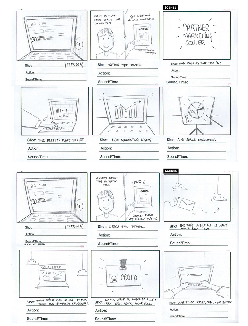
Motion Graphics video to explain Cisco Systems China Partners Platform and how advantageous it is for all staff and associates to use it.
Cisco Systems is one of the giant IT companies in the World, with 70,000 workers. (They created the first commercially-successful router!). Cisco has a long history in China that spans over 20 years, delivering meaningful innovation to the people and partners there.
In 2014, Cisco Systems in China Headquarters, Beijing, had the challenge of creating something different to communicate the new Partner's Platform in a creative and visual way. Other than instructions manual, tutorials or reference websites, the first impact should be something that gets everyone's attention.

So, as the Creative Director of our own studio, Kuiki, I helped Cisco Systems Headquarters in Beijing, get a new, simple and effective way of transmitting the advantages of workers using their own marketing and communication platforms. We created three pieces of Motion Graphics animated videos that they could use for that.
User research focuses on understanding user behaviors, needs, and motivations through observation techniques, personal interviews and focus groups, to understand why most of the workers did not know about the improved commercial skills on which they spent a lot of resources to improve.
With the proper planning, we were able to confidently move into creating the storyboard for an audiovisual product. We decided to focus more on the easiest way to explain every advantage, because once people knew the programs, they really loved them. The challenge was to show it to them in a nicer, more effective way that could be understood even without audio or captions.

User testing is a technique used in user-centered interaction design to evaluate a product by testing it on users. This can be seen as an irreplaceable usability practice since it gives direct input on how real users use the system. We decided to use this technique in our app with these tasks:
| Before | After | |
|---|---|---|
| Newsletter Registrations | 2 | 5 |
| Find MK Material | 3 | 5 |
| Follow in Weixin | 2 | 5 |
| Use Forum | 3 | 4 |
| Use rewards | 4 | 5 |
One major change in creating the video was focusing on the visual style. Our aim was to improve user engagement by understanding more about Cisco Systems` advantages in China and to show all the benefits using a closer language and the simple, effective style of Flat Motion Design trends.
Creating a motion graphics video that would be placed all over the building was a very interesting solution to not spamming workers while maintaining to bring to their attention these tools to increase productivity in a different way.
As a result, we created a piece of video that attracted everyone inside the building because of its contrast with the style of the former corporate communication. We provided users a very easy way to understand animated instructions, even with muted audio, showing the advantage of using this over the email they had ignored for months. We solved the difficulties of the previous way of communication which wasn't focused on offering something that was easily understandable.
Simplicity is the ultimate sophistication. Leonardo Da Vinci, polymath.
Cisco Systems ordered two more versions of the video from us within the same year, focused on adding two new services for workers!
Are you working on something great? I would love to help make it happen! Drop me a
message and start your project right now! Just do it. I will not spam you
with
e-mails or add to MailChimp list.