A complete redesign of a Sport Management App for FECAM, a Spanish NGO for sports championships within the Special Olympics.
FECAM is a 25 years old instiution that promotes the integration of mental disabilities through sport. They are honor members of the Special Olympics International and the organized national championships in Spain for 8 sports every year. FECAM grants more than 1800 licenses for athletes, coaches, and delegates every year and its championships are followed in realtime by sportsmen and spectators every weekend.
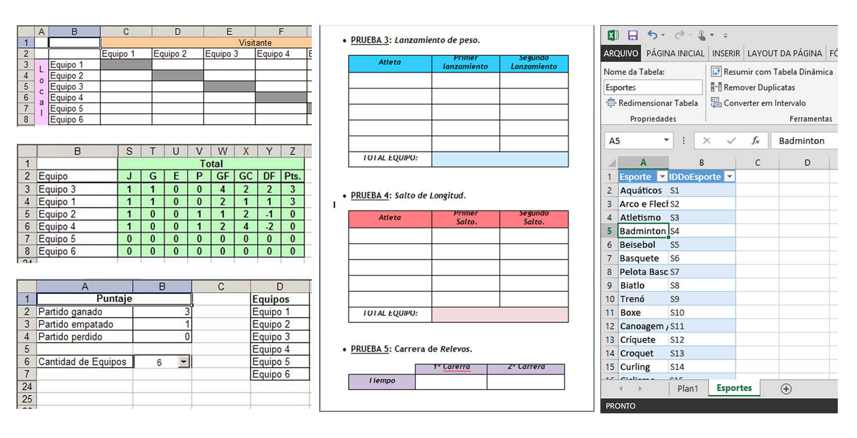
In January 2013, FECAM realized its current website is almost inaccessible from mobile devices and its traditional admin panel is based on an old technology multipurpose software that doesn't let them the immediacy.

So, at the end of 2015, I helped FECAM redesign their Sport Management Web app. Acting as their Lead UX Designer, we backed their original needs and we defined the guidelines and most of the features that you see to this day.
User research focuses on understanding user behaviors, needs, and motivations through observation techniques, task analysis, and other feedback methodologies. For me, user research is “the process of understanding the impact of design on an audience”.
Due to FECAM`s project needs, they required different actions from different people. They couldn't afford to spend more time managing an old software where staff couldn't edit their team members or creating championship rounds manually anymore.
With common scenarios in place, we were able to define detailed personas, using their vast data pool. The personas looked something like this:
Without a clear understanding of what your product does, what problems it solves, or for whom it solves these problems, ultimately, there’s no need for your product. Our goal was to make sure FECAM's app solved typical online ticketing problems in a clear and simple way.
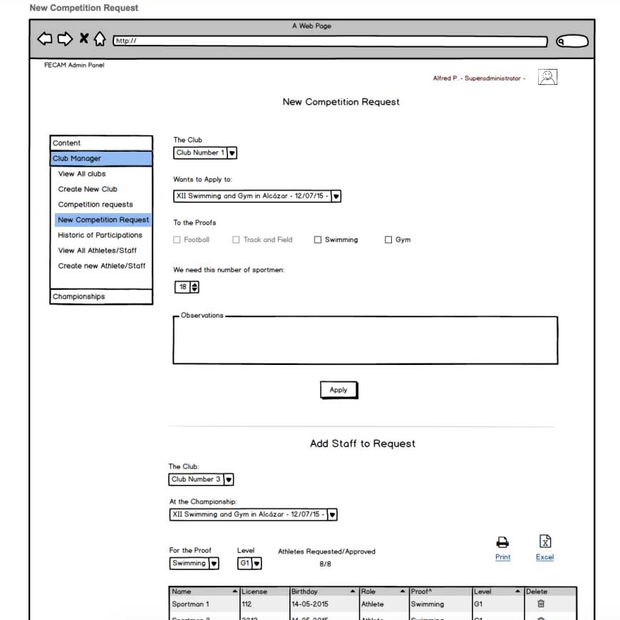
With the proper planning, we were able to confidently move into creating wireframes for the app. We took the decision to focus more on the functionality and structure of the app, using Balsamiq and opting for low-fidelity wireframes with very little detail. Ultimately, we could add design elements later. What was important for our users was that the product, above all, was clear and simple.

User testing is a technique used in user-centered interaction design to evaluate a product by testing it on users. This can be seen as an irreplaceable usability practice, since it gives direct input on how real users use the system. We decided to use this technique in our app with these tasks:
| Before | After | |
|---|---|---|
| Create New Championship | 2 | 5 |
| Submit Club and Teams | 1 | 5 |
| Generate double round K.O. Tournament | 1 | 4 |
| Identify non-eligible players for a proof | 3 | 4 |
| Check real-time results | 1 | 5 |
One major change in the Web app, was focusing on the speed with which the association needed to create championships and the speed people demanded to check the results. Our aim was to improve Admin and visitor interaction by understanding more about a Sport Manager’s personal preferences, allowing us to predict and tailor relevant options to every different sport and its features.
Once we created the tools to generate championships and to add sports, the next step was to dive deep into teams, matches and series. This is a complex system of conditions and it differs between players who qualify for the next round and those who are not qualified after the proof.
We also needed to create a simpler, easier, and more structured way to see the sports while the Championship is being celebrated. By categorizing the event by sports and adding search features, we would get the casual visitor to easily identify where the player they want to find is and their competition mark.

As a result, we redesigned a Web app for Sport Managers with the same needs they had for years which weren't solved with the original website they bravely designed with their internal department. The Web application they have today is a powerful tool that quickly solves the previous mechanical work. UI testing gave us an idea of how to properly prioritize the structure of the application and provide the most positive user experience for FECAM's staff and users.
We understood the errors of the previous version of the application, which was mostly focused on solving very basic needs. The client understood that the less time you take to correct mistakes, the more time they have to progress and search for their real needs.
Sometimes when you innovate, you make mistakes. It is best to admit them quickly, and get on with improving your other innovations. Steve Jobs, US computer engineer & industrialist.
The Special Olympics is going to add more integrated sports in organizations all over the world and we'll have a lot of work to do on the application together with FECAM`s new Clubs and Teams. Stay tuned!